Be yourself; Everyone else is already taken.
— Oscar Wilde.
This is the first post on my new blog. I’m just getting this new blog going, so stay tuned for more. Subscribe below to get notified when I post new updates.
Be yourself; Everyone else is already taken.
— Oscar Wilde.
This is the first post on my new blog. I’m just getting this new blog going, so stay tuned for more. Subscribe below to get notified when I post new updates.
Introduction
So for my non-western style art I decided to go with Japanese art more specifically woodblock printing art. Wood block printing was a technique used for centuries in japan it became popular in art for japan around the 17th century with ukiyo-e artist. Now to answer the question of, what is wood block printing, well to explain it simply its basically taking a wooden carving with ink on it and putting a piece of paper on top of it and pressing the paper down on it to copy the wooden engravings and then using other carvings to add pigment and other shapes to the painting. It’s actually kind of cool to see would recommend looking it up to see how it’s done.

The Great Wave off Kanagawa by Katsushika Hokusai
To start off I have the most famous Wood printed piece “The Great Wave off Kanagawa” , an iconic piece that was made around 1830 by Hokusai. This is a great piece that shows off man vs the raging sea. You can see the men crouching down clinging to the boat as they approach the giant wave before them, unable to do anything more then face the wave head on. It’s a cool piece with the wave looking like a massive force only made larger when by this perspective has mount Fuji in the background looking small by comparison. I also can’t imagine how long this took with the different shades of blue and other pigments having to be added in with a different block each time. I also can’t deny this is the piece that came to mind when I thought of non-western art and decided this had to be the first piece I talked about.
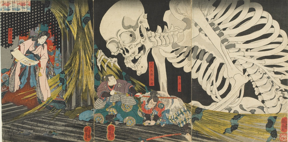
Takiyasha the Witch and the Skeleton Spectre by Utagawa Kuniyoshi
I love this piece partially cause I just some spooky scary skeletons. This piece comes from Kuniyoshi who loved to make his own depictions of mythical legends. He made Takiyasha the Witch and the Skeleton Spectre in the mid 1840’s as a depiction of a princess who turned to the dark arts in seek of revenge of those who murdered her father. The story follows Princess Takiyasha who’s father was killed during a rebellion and escapes and meets a hermit who teaches her magic which is shown with her holding a scroll which she is reading to summon the giant skeleton. The other bit of the story is the two samurai there who look to be cowering below the skeleton, these two are samurai sent by the emperor to slay the witch and stop her dark arts. I love this piece especially when you know how long these wood prints have to take especially when there are this many different pigments and patterns that need to be individually added to get such a detailed and colorful piece. Also yes, I love this piece cause it has a giant monster and I think giant monster are awesome.

View of The Lake at Hakone by Utagawa Hiroshige
For my last piece we move from terrifying waves and spooky skeleton to a peaceful and and scenic piece know as “View of The Lake at Hakone”. It’s a piece made around 1833 or 1834 by Utagawa Hiroshige known for making beautiful landscape paintings using the woodblock printing style. I like this piece because of both the beautiful landscape look of the piece as well as the use of blues, oranges and tan white color. It gives it a for lack of a better reference a quilt like color pattern that I don’t see used that often. I think it’s kinda cool to see these blue and orange mountains instead of white and brown or green mountains as they are often painted.
Conclusion
I choose this particular country and art style since I have a love for Japan and their interesting, creative and sometimes strange ideas and this art style just because it was such a unique Idea on how to make a painting and wanted to tall a bit about it. I think Wood block printing art has such a cool and unique look to it and mixed with some of the creative imagination that comes from Japanese culture it would be a fun topic to look into. I hope you enjoyed these painting I showed for this final blog post.
Introduction
In modern art you can find art everywhere and can be for anyone. Today art is so beloved and wanted cities even have budgets for public art projects for their cities. With this many artist have used this to both show off their own idea on a grand scale it can also be a way to show in a artistic form a city’s culture and/or history.

The Black Ghost by Svajunas Jurkus and Sergejus Plotnikovas
The Black Ghost or The Juodasis Vaiduoklis as it’s known by the people of Lithuanian where this spooky statue can be found. This amazing bronze statue of a ghost with a lantern was built in 2010 about a(n) old story of the town. The story is not any evil wicked story like one might think that comes with ghosts but in actuality it’s a story of a ghost warning a guard to have the city gather more grain and lumber for the coming year. Due to this warning the town decided to follow the advice and when the following year came the city faced hard times that need much food and lumber to keep it’s people warm and fed and do to following the ghost’s warning the little port town was able to survive.
This sculpture is so cool me and it’s probably cause I’m such a fan of spooky images like ghosts and monsters. I would love to be able to go and see this sculpture at some point in my life. Also I think sculptures like this are so cool in the fact they come with a story with them which in turn make myself as well as others more interested in the town itself making it a great piece of art to get people interested in coming to your town. This is what I think is the benefit that comes with these public-funded pieces of art that anyone can come and see, it’s a great way to bring people into your town and help a town grow its tourism..

The Magic Mouse by Svajunas Jurkus and Sergejus Plotnikovas
This adorable little statue known as The Magic Mouse is a bronze statue located in Lakpedia, Lithuanian and is done by the same two sculptures who made The Black Ghost. The Magic Mouse was made in response to a cat statue that is located nearby. The reason this mouse statute is called “The Magic Mouse” is because if you whisper in the mouse’s ears it will turn your words into magic and then into a reality.
This adorable little statue known as The Magic Mouse is a bronze statue located in Lakpedia, Lithuanian and is done by the same two sculptures who made The Black Ghost. The Magic Mouse was made in response to a cat statue that is located nearby. The reason this mouse statute is called “The Magic Mouse” is because if you whisper in the mouse’s ears it will turn your words into magic and then into a reality.

Cloud Gate A.K.A The Bean by Anish Cooper
Here we have one of if not it’s most famous publicly funded art piece in Chicago know as Here we have one of if not it’s most famous publicly funded art piece in Chicago know as Cloud gate or even better known as THE BEAN(honestly a way more accurate and fun name). Cloud Gate is a 33 ft high reflective bean-shaped sculpture that got it’s nickname while it was being built by the public before it became public knowledge that the famous or infamous artist Anish Cooper named his sculpture Cloud Gate but even after that the nickname stuck. It’s a great sculpture that the city-funded to be the entrance everyone goes under as they enter Millennium Park
The Bean is a cool idea of using reflective materials to reflect and warp the perspective by the curved shape of the sculpture giving the city and those who approach it a new way to view their surroundings. Also fun fact since people seem to love to touch sculptures and the bean is no exception, The Bean is wiped down at least twice a day to remove all the handprints.

Arcelormittal Orbit by Anish Cooper and Cecil Balmond
The Arcelormittal tower is the largest public art in all of Brittan standing at 114 meters tall. It was sculpture that was commissioned by chance. The former mayor of London, Boris Johnson and the CEO of ArcelorMittal (largest steel company in the world),Lakshmi Mittal talking about how they wanted to make a monument to commemorate the summer Olympics that would be held in London in 2012. It also has a slide built in that visitors can choose to slide down, which will be high up on things I The ArcelorMittal tower is the largest public art in all of Brittan standing at 114 meters tall. It was a sculpture that was commissioned by chance. The former mayor of London, Boris Johnson and the CEO of ArcelorMittal (largest steel company in the world), Lakshmi Mittal talking about how they wanted to make a monument to commemorate the summer Olympics that would be held in London in 2012. It also has a slide built in that visitors can choose to slide down, which will be high up on things I will do if I ever visit London
This is a crazy looking sculpture that almost looks impossible to see standing with its weird bends that give it a look like the metal beams are bending and wrapping itself around the building. I love the red beams on the silver building almost making it like a gift to me with a bow.

Dignity Of Earth And Sky by Dale Lamphere
Dignity is a 50-foot tall statue that can be found near Chamberlain, South Dakota on interstate 90. Now this is an interesting statue that was funded by a couple in Rapid City named Norm and Eunabel McKie. They funded this to be a monument for the public and to honor the Lakota and Dakota people. it’s supposed to represent the wisdom and perseverance of the Native people of South Dakota. Its diamond-shaped pattern is filled with led lights that light up at night.
This a great piece that I will 100% will go see the next time I go visit South Dakota. it’s such a great statue I love the blanket design surrounding her with the different shades of blue and grey. Also I love the look of the woman herself. I keep trying to get a guess of her age but I can see the features of a young woman but at the same time she looks older to me as well, which can probably be attributed to the fact 3 different models of varying ages were used when designing this sculpture.


Arch Of Dreams by Dale Lamphere
The Arch of dreams is a beautiful color-changing arch in Sioux Falls, South Dakota. The newest monument to be added to South Dakota’s long list of amazing pieces of art it was finished in the summer of 2019. The arch of dreams stands to about as long as a football field and is 85 feet tall. The arch of dreams is meant to be a tribute to dreamers past present and future. The arch is supposed to be the dreamer’s journey to attain said dreams where the gap is the leap of faith that they need to take to achieve their dream.
Ok, I may have a bias towards South Dakota sculptures since my family is from there so it’s a place I commonly visit but I think this arch is a simple but awesome monument that has a great way of encapsulating the journey for those who chase their dreams. Also I think the look of the arch over the water since you get the cool reflection of the light of the arches on the water making it probably a great thing to kayak under at night.
Sources
https://www.atlasobscura.com/places/the-black-ghostcura.com/places/the-black-ghost
https://arcelormittalorbit.com/about/about-the-arcelormittal-orbit/
Introduction
For this art gallery I decided to focus on the art that came from the harsh period of time known as the Great Depression. It was a low point for many in that period and the art that came from the period emphasized just what it was like for people in that period.

Apple Vendor
Lets start off with my favorite piece “Apple Vendor” by Barbara Stevenson, the piece was painted in 1933. It’s a great piece that shows a man trying to make a living by sitting out on the sidewalk to sell his apples. This piece helps sell me on the time period of people without work trying to find a way to find a way to provide for themselves. The piece makes it tell even more of a message when one considers the woman and boy behind him are thought to be the man’s family. It makes me think they are waiting to see if he has any success today as if what he sells will determine their future. It also just shows the hard times when you look at the condition of the stand is faded and looks like it was more hand made like this was the best the man could afford to present what he has to sell.
Personally I really like this piece I would love to have it in my home. I enjoy the man at the center of the photo and how you cant see his eyes to tell exactly how he feels about the situation. H e just looks stoic as he sits and waits for someone to approach him. I also love the use of color in this as well as the overall style. It has a gritty or rough look to it that helps make it capture more of that harsh theme that the depression gave off.

Sand
This piece known as “Sand” was painted in 1936 by an American painter by the name of George Biddle. It’s a great piece that I think highlights a profession that was hit the hardest by the event that happened by the Great Depression, Farmers. It’s a piece that both shows the shambles of a farm and it’s dead farm life. A piece that you can tell is portraying the effects of the dust bowl that ruined many homes around the time of depression. I love this piece just because of how well it captured the spirit of this event it’s a truly great shot that looks like a painted version of what the farms actually looked like during that period of time, a ghost town. The piece also just captures the dark period by keeping it in black in white adding more to the affect of just how sad these time were with these monotone colors.

Migrant Mother
For my last choice of an image for this gallery I chose the picture known as “Migrant Mother” taken by American Photographer Dorothea Lange. The photo was taken at a camp outside of Las Angeles in March of 1936.This famous photo that is said to truly show the affects the depression had on a person. You can just tell imminently what the woman is feeling with just one look at her face, the sadness and anguish that she is feeling as her two children cry on her shoulders. It’s a gripping piece that just showed the defeat people felt during that time where they couldn’t provide for their families and didn’t know if there was any way for them to be able to be able to get back to the prosperous times they knew before The Depression.
Sources
Biddle, George. “Sand!” Brooklyn Museum, Brooklyn Museum, www.brooklynmuseum.org/opencollection/objects/92817.
Stevenson, Barbara. “Apple Vendor.”Smithsonian American Art Museum, Smithsonian American Art Museum, americanart.si.edu/artwork/apple-vendor-23048.
“Migrant Mother, 1936,” EyeWitness to History, www.eyewitnesstohistory.com (2005).
Introduction:
This time around instead of looking at paintings I decided to do my theme on interior Rococo architecture more specifically the decor inside building made using rococo style. I chose this mostly cause I personally love the architecture more then rococo style paintings. This type of architecture started to be active in the 1715 and ended around 1789. Rococo architecture mostly took place France and was usually done for Royalty or rich aristocrats. Rococo architecture was meant to branch away from the religious influence in art and show more the humanities freedom and joy. Rococo Architecture can be identified by it pastel or light colors and shell or plant like ornaments.

Hôtel de Soubise
The image above comes from Hôtel de Soubise, it is located in Paris, France. The hotel was built in 1375 for Olivier de Clisson, but had it’s interior remodel with Rococo style decoration in 1735. The interior was done by French architect Germain Boffrand. I really like the gold covered lining of the roof starts spread out and comes together at the center of room and makes my eyes see it like running water flowing to in spot and draining down to the chandelier. Also the way the white figure or position making it look like they are sitting on the outer circle of the roof are just a really fun touch to me.

Marble Hall in Upper Belvedere Palace, Vienna, Austria
Now moving from from France to Austria my next piece showing off rococo architecture is the Beledere Palace in Vienna Austria,. The architect who designed the interior of this palace was Johann Lukas von Hildebrand but the one who gave it’s painted rococo style art on the ceiling was an Italian artist by the name of Carlo Carlone. The marble hall was built sometime in the early 1720’s The building was built with baroque style in mind but was later changed to have rococo style decor.
I really like this one’s use of blue and white for color on both the chandeliers as well as the ceiling. especially the ceiling art which it gives a bright but cloudy summer sky look that just makes me think of nice clear skies. Which definitely has me feeling excitement for the approaching summer. Also similar to the hotel above it use very similar style chandeliers that are surrounded with candles giving almost a dangling a flower by a string look which personally I always think has a cool and fun look to them. As child my grandma had these in her house and I always loved looking op at them and also wanting to spin them.

Church of Wies
My last piece of rococo style architecture is the Church Of Wies in Steingaden, Germany. it was done by German architect Dominikus Zimmermann in 1745. This piece is considered the height of Zimmerman’s rococo style architecture.
This piece just oozes rococo style art with its light colors and shell decor on the walls. You can tell that it definitely conveys the goal the architecture was going for in creating a church that can grant a miracle with it’s overwhelming well crafted decor and the bright and positive atmosphere I see when I look at this beautiful church.
Sources
“Baroque Art vs. Rococo Art: Characteristics and Definition.” Invaluable, 28 Jan. 2019, www.invaluable.com/blog/baroque-art-rococo-art/.Centre, UNESCO World Heritage. “Pilgrimage Church of Wies.” UNESCO World Heritage Centre, whc.unesco.org/en/list/271/.Craven, Jackie. “Rococo and the Elegant Designs of the Late Baroque Period.” ThoughtCo, ThoughtCo, 9 Jan. 2019, www.thoughtco.com/rococo-art-architecture-4147980.
The Triumph Of The Immaculate
by Paolo De Matteis

The piece I chose this time to represent the Baroque is the painting above called the Triumph Of The Immaculate. Similar to the last piece I talked about in my previous blog it’s a really detailed piece with a lot going on.I couldn’t find much on the history of piece but I do know it was drawn around early 1700’s The piece really draws you into the one in the middle who is Jesus by having him be at the very center of the piece with many of the people in the painting looking at him while he appears to be looking up at the man above who appears to be god. Meanwhile down below it looks like A roman emperor is reaching out a hand as if to give aid or converse with the woman approaching him while his subjects look at what the emperor is going to do. I really enjoy some of the overall characters you can see in this painting they all seem to reaching out for something and it makes me wonder what they are all reaching for. Are they greeting god who also has his hand reached out. There’s also a lot of other little details that peak my curiosity and keep me staring at the piece like the man dressed in all black in the clouds compared to how most of the others are in bright colored or white cloths or why is there a pope in the clouds instead of in the mortal realm. Also what looks like a child falling from the clouds being held up by some freakish arm of the person in a red cloak. I really like this piece it keeps my eyes focusing on Jesus and slowly taking in every detail around him and finding more and more appreciation for every part of the piece
“The Battle of Alexander at Issues” by Albrecht Altdorfer

Introduction To The Piece
This beautiful piece of art known as, “The Battle of Alexander at Issues” ,painted in 1529 by the famous German artist known as Albrecht Altdorfer. He was commissioned to draw the battler between Darius and Alexander The Great by the Duke of Bavaria. It’s a great piece that shows off a great example of a world landscape painting that also shows off a grand battle in this marvelous landscape.
What “The Battle of Alexander at Issues” is portraying
As the duke probably wanted the piece was to have a painting showing the west power against one of history greatest empire in history the Persian Empire. It’s rendition of the pivotal battle that allowed Alexander to lead his conquest through Persia. This piece captivates how this was the start of the fall of the Persian empire to Alexander.
My View On “The Battle of Alexander at Issues”
Personally I enjoy this piece a lot and didn’t expect myself to be writing about for my blog. I originally thought I would stick to the artist I know like the famous 4 artist that inspired the name of a certain group of turtles I grew up watching. Although that was my plan I figured that I should look at some more northern renaissance art since I wasn’t as familiar with their artist and saw this piece and was amazed right at first glance.
This one painting pack so much detail into every single part of it. No matter where I look I can always find something that is just a sight to behold. Like the setting sun and the rising of the moon being a beautiful sight of symmetry between the two. or the Nile river of Egypt in background or what the painting was commissioned show King Darius retreating from Alexander the Great. In my opinion you could break up parts of this paining and each part could be a great painting of it’s own just by how much detail and care went into every single part of this painting. Also It’s an interesting perspective I found my eyes looking over the great battle as my eyes are drawn to the message descending from the sky which learned is even the heavens believe in Alexander and the west that they wish to see victory against the Persian empire. Personally I would love to get a printed piece of this painting just so I can have an even better look at everything this painting shows.
Sources
http://www.all-art.org/history230-10-2.html
https://www.ibiblio.org/wm/paint/auth/altdorfer/battle-issus/
https://study.com/academy/lesson/altdorfers-the-battle-of-alexander-at-issus-subject-style.html
Dr. Steven Zucker and Dr. Beth Harris, “Albrecht Altdorfer, The Battle of Issus,” in Smarthistory, December 9, 2015, accessed February 17, 2020,
Hello, my name is Vince Nelson, I am a senior in college working to get my bachelors in Criminal Justice. This is my final semester of college. I’m from Butte, Alaska and have lived in Alaska all my life.

I would probably say I decent interest when it comes to art. I defiantly enjoy looking at some fan created art created by fans of shows or other media I enjoy. I also am a huge sucker for oil paintings definitely my favorite kind of art. I wouldn’t say I’m huge owner of art. The only art I own is a statue of the thinker I got to put in my apartment since I figured college and having a thinker statue was a fun combo. I do go to the occasional art museum just to see what people have made. I don’t really draw or sculpt mush aside from maybe the occasional attempt to make a wood carving when I was younger or drawing some doodles.
This is an example post, originally published as part of Blogging University. Enroll in one of our ten programs, and start your blog right.
You’re going to publish a post today. Don’t worry about how your blog looks. Don’t worry if you haven’t given it a name yet, or you’re feeling overwhelmed. Just click the “New Post” button, and tell us why you’re here.
Why do this?
The post can be short or long, a personal intro to your life or a bloggy mission statement, a manifesto for the future or a simple outline of your the types of things you hope to publish.
To help you get started, here are a few questions:
You’re not locked into any of this; one of the wonderful things about blogs is how they constantly evolve as we learn, grow, and interact with one another — but it’s good to know where and why you started, and articulating your goals may just give you a few other post ideas.
Can’t think how to get started? Just write the first thing that pops into your head. Anne Lamott, author of a book on writing we love, says that you need to give yourself permission to write a “crappy first draft”. Anne makes a great point — just start writing, and worry about editing it later.
When you’re ready to publish, give your post three to five tags that describe your blog’s focus — writing, photography, fiction, parenting, food, cars, movies, sports, whatever. These tags will help others who care about your topics find you in the Reader. Make sure one of the tags is “zerotohero,” so other new bloggers can find you, too.
Have a WordPress.com account? Log in now.

